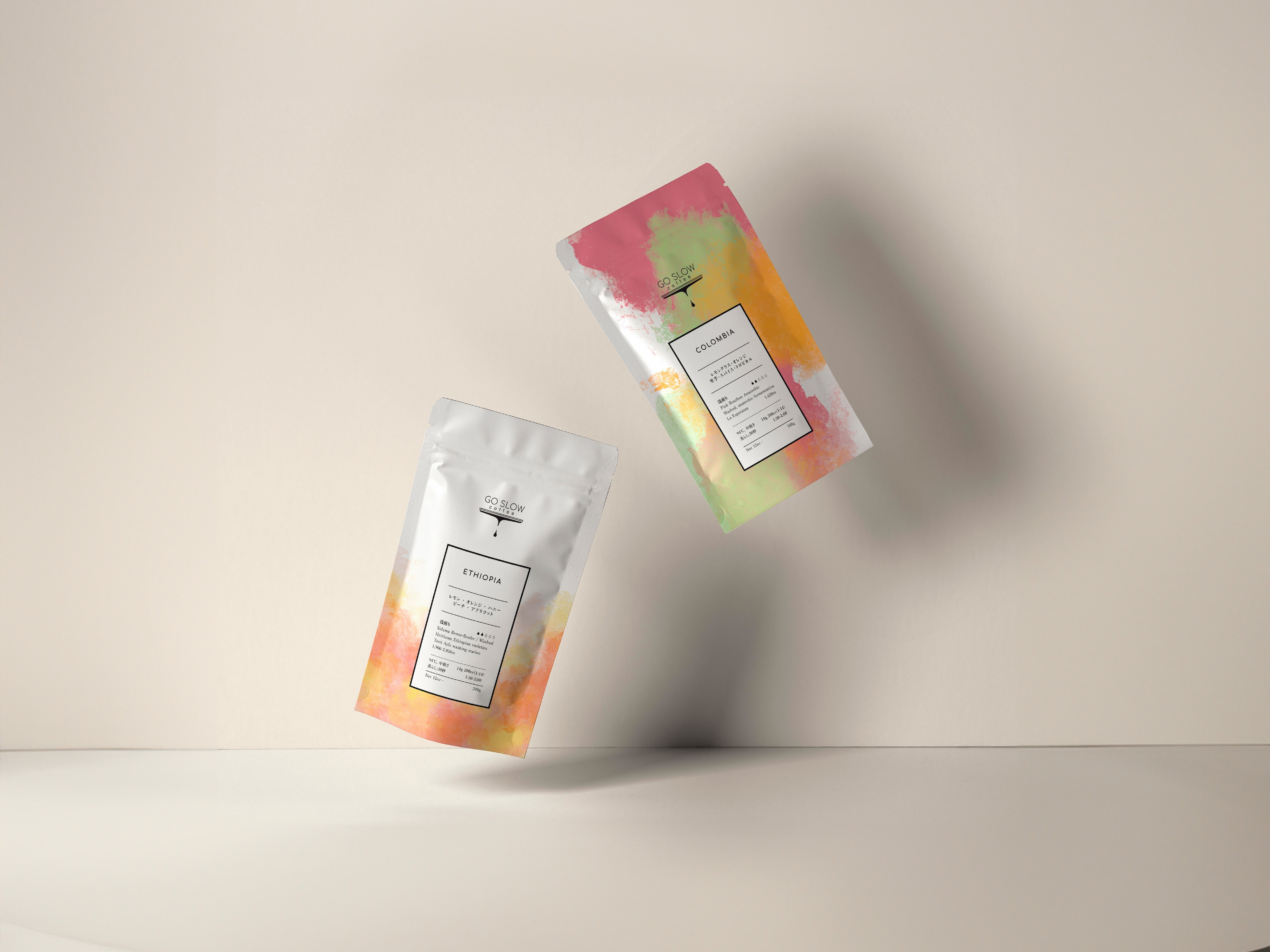
Work: Brand identity, packaging designs
Year: 2023
Client: Seika
Year: 2023
Client: Seika
EN
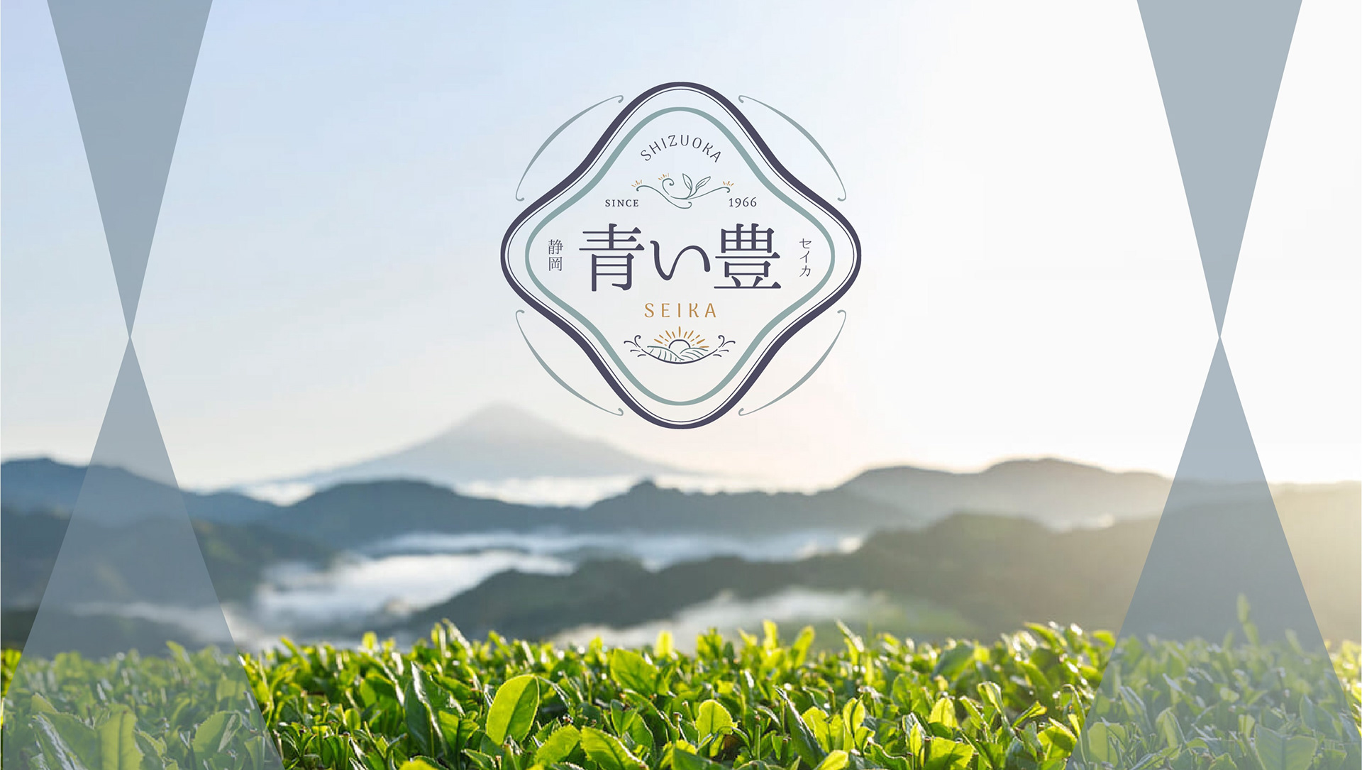
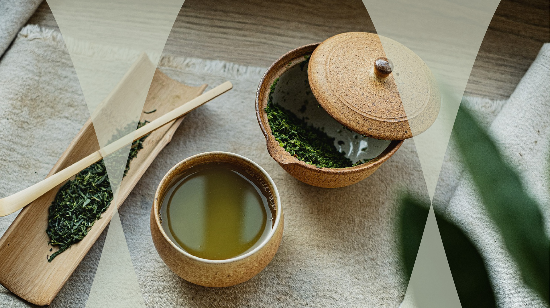
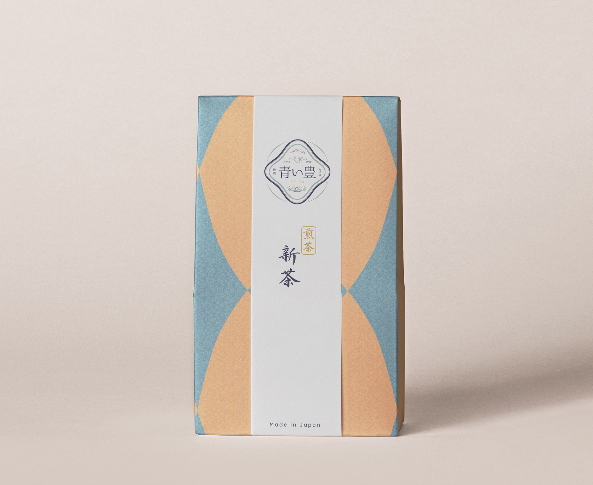
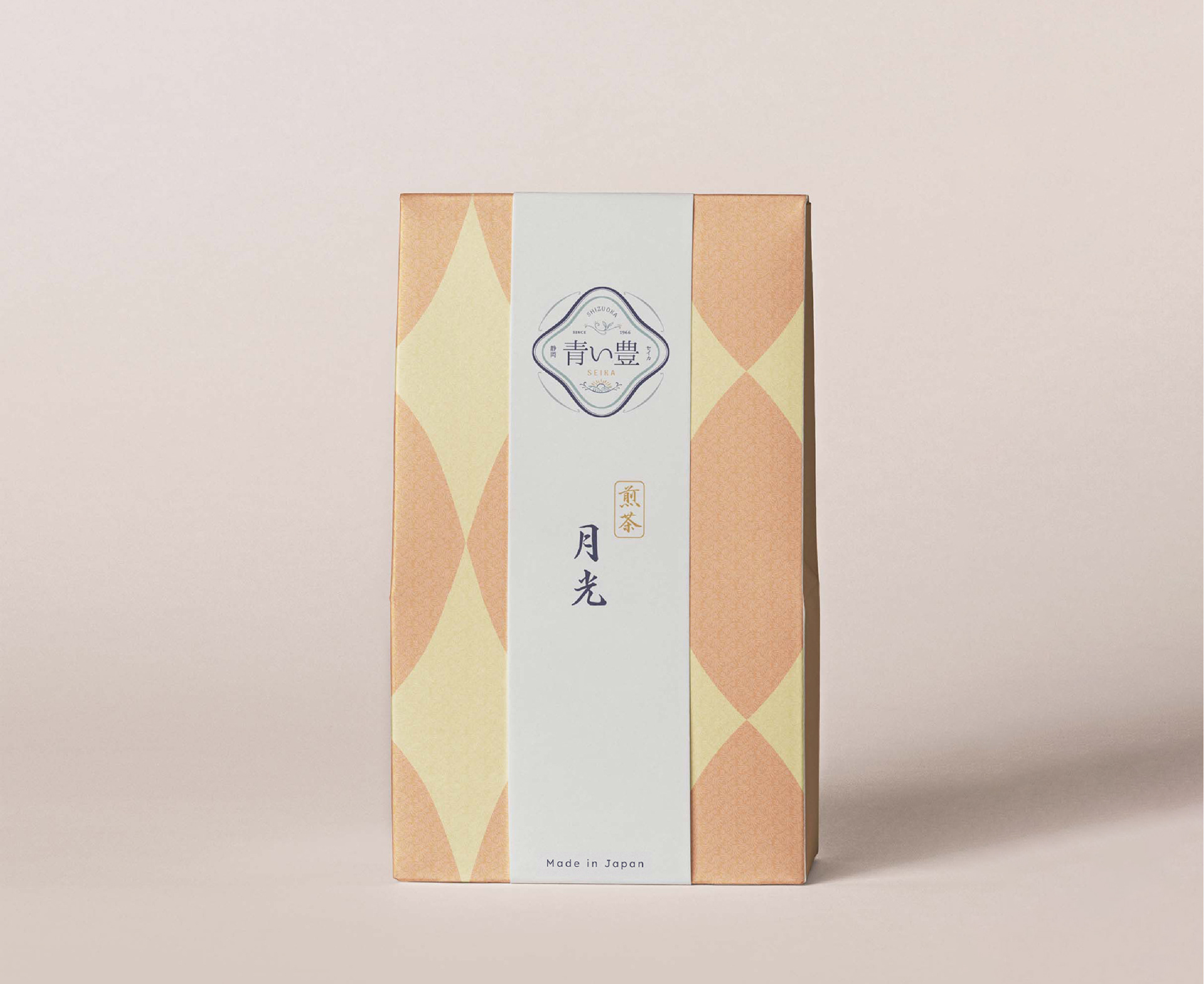
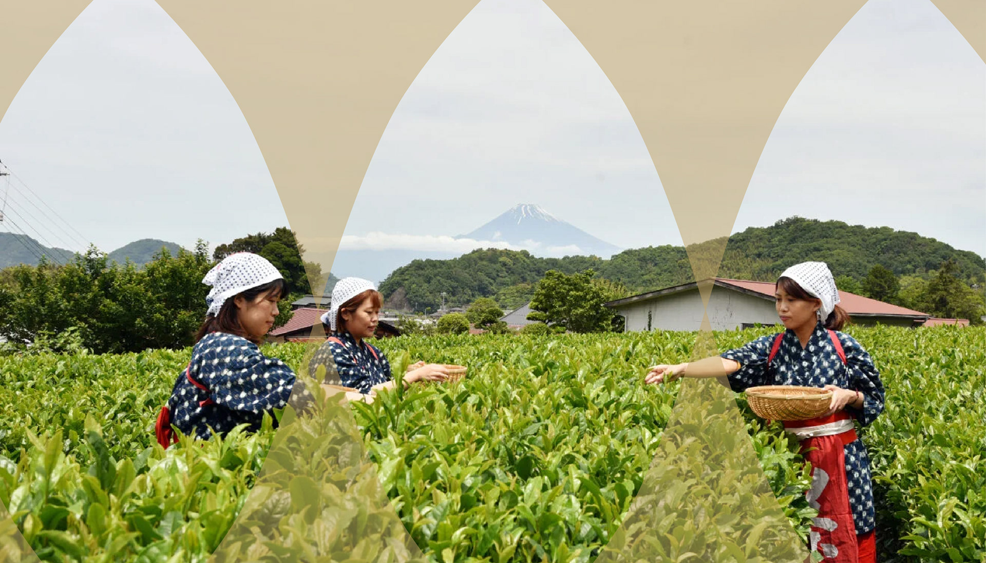
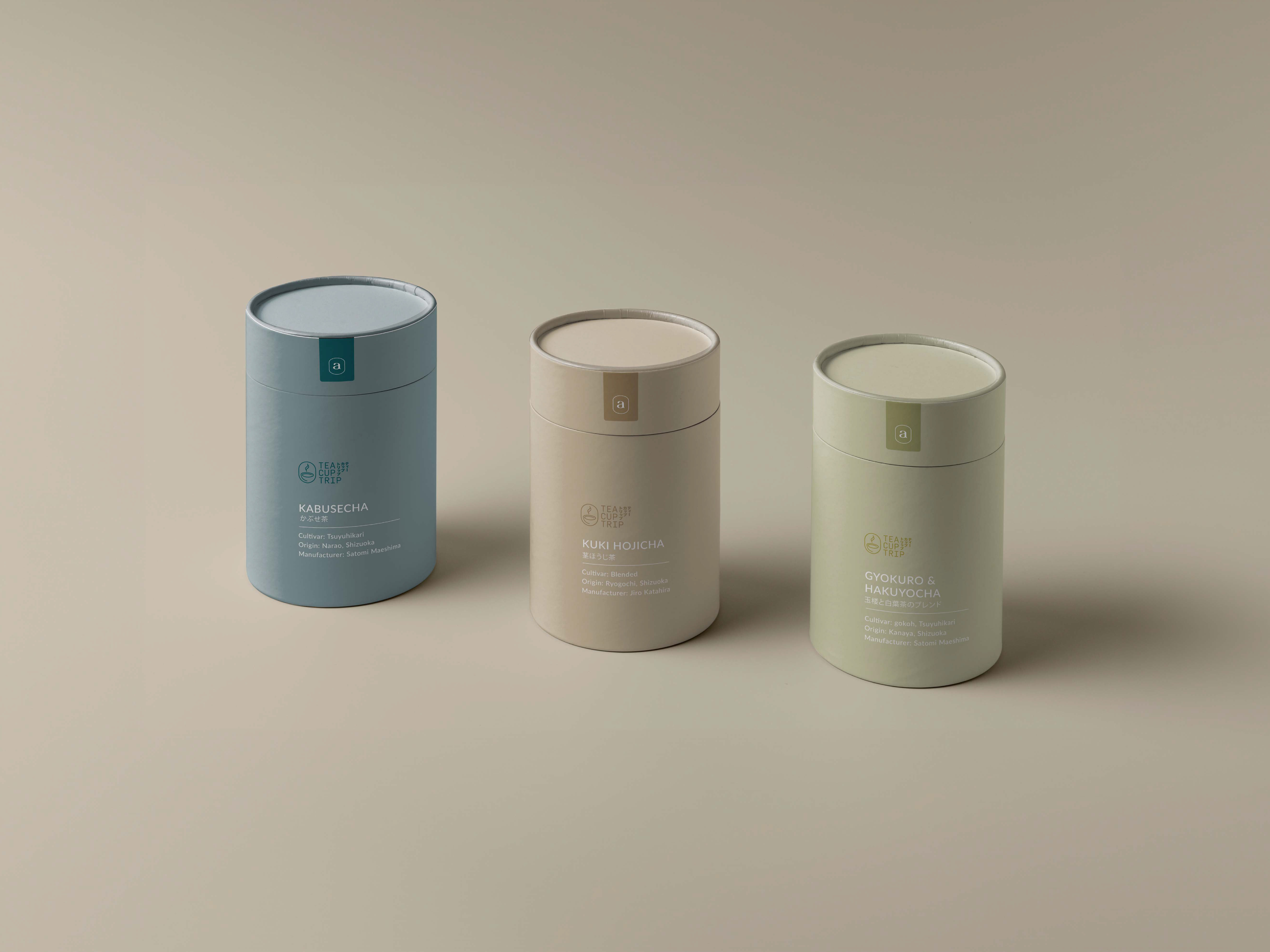
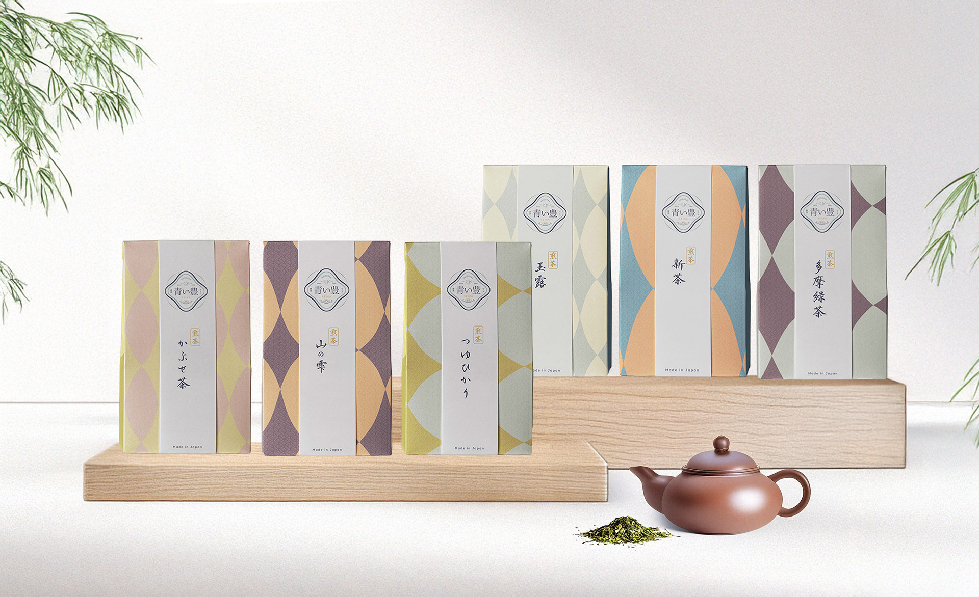
Seika is a tea farm & tea store located in the prefecture of Shizuoka, Japan.
Above being a tea producer working with some of the oldest and finest tea cultivars, Seika aims to offer an immersive experience transporting our senses to the serene landscapes and rich tea traditions of Shizuoka.
Looking to expand their business locally and further along the way internationally, their wish and vision was for the brand to reflect their authenticity along with a quite retro japanese design atmosphere, while keeping a modern feel to it.
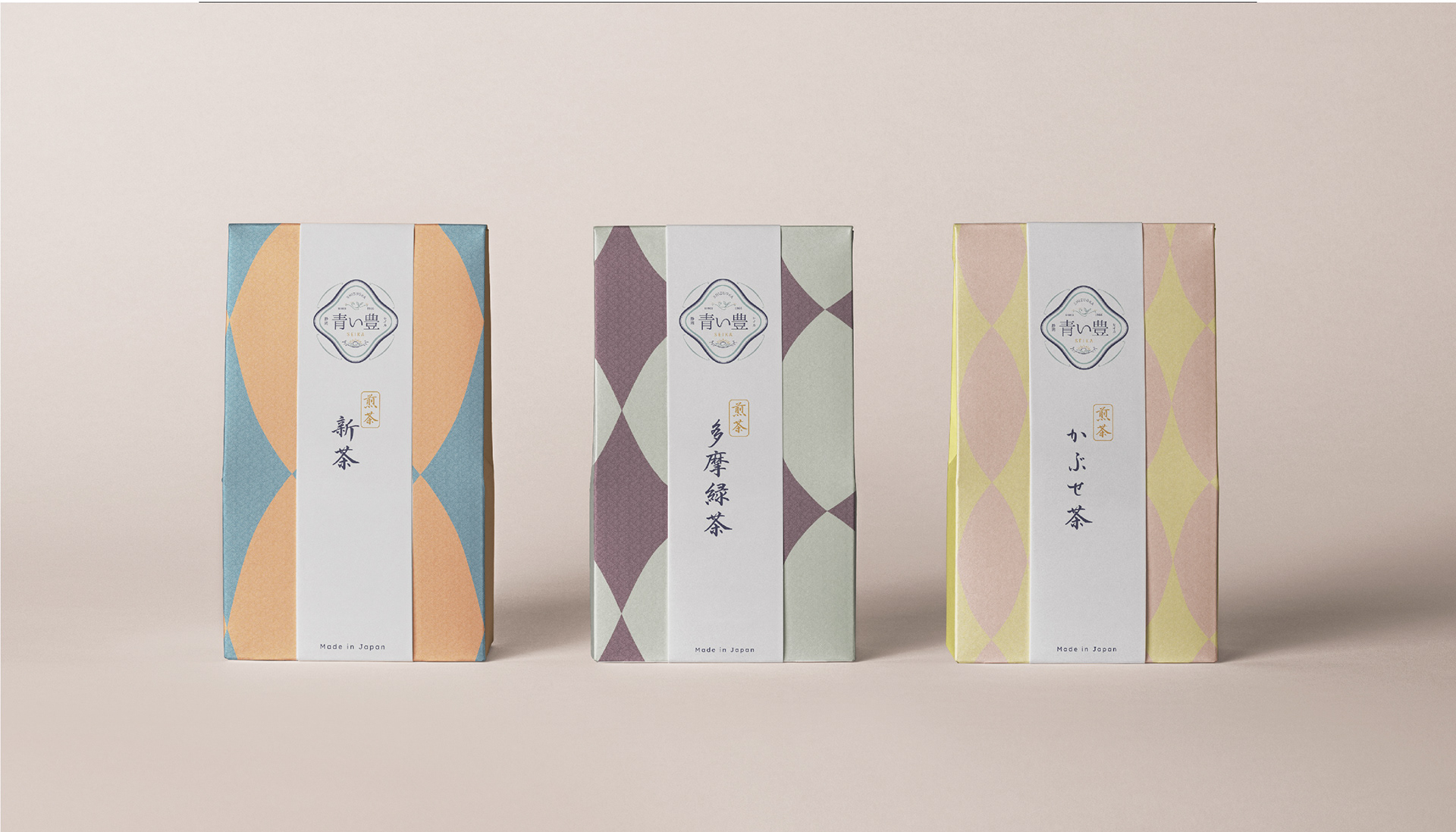
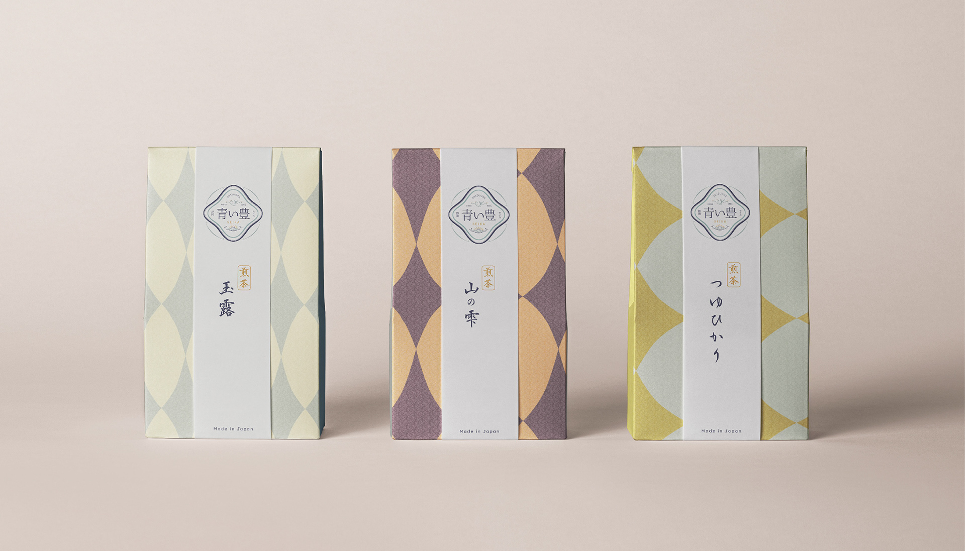
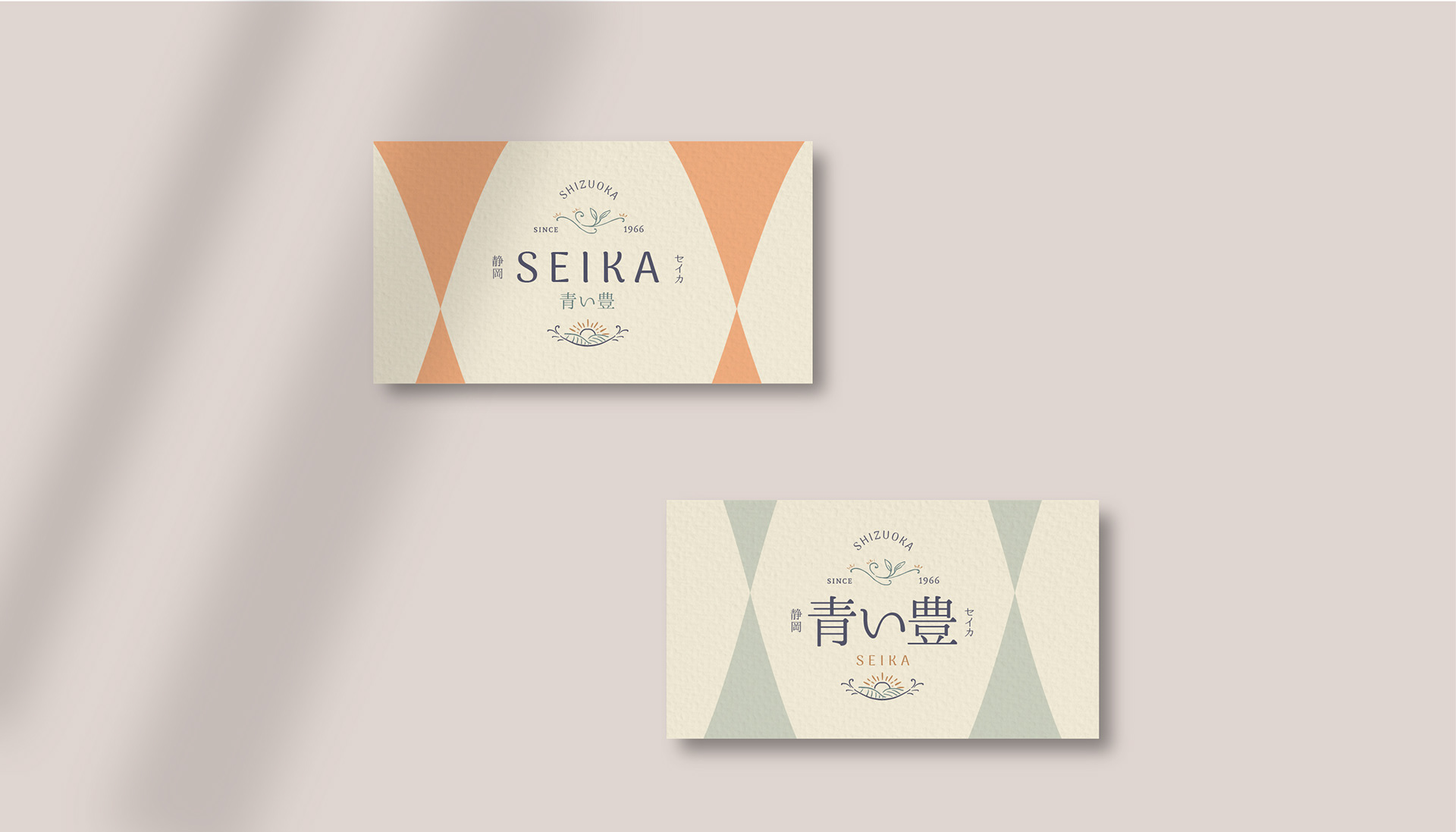
Written with the characters 青 "green, young" and 豊 "abundance, richness", Seika can be translated as the young, green abundance. The challenge was here to come up with a name visually and sonorously appealing in both japanese and roman characters.
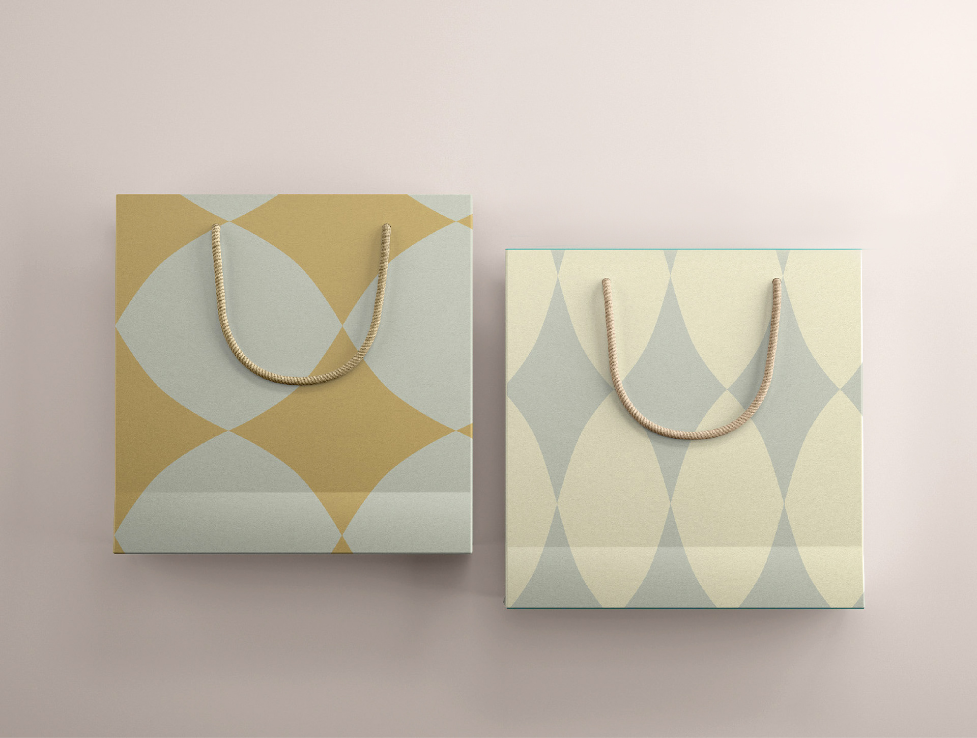
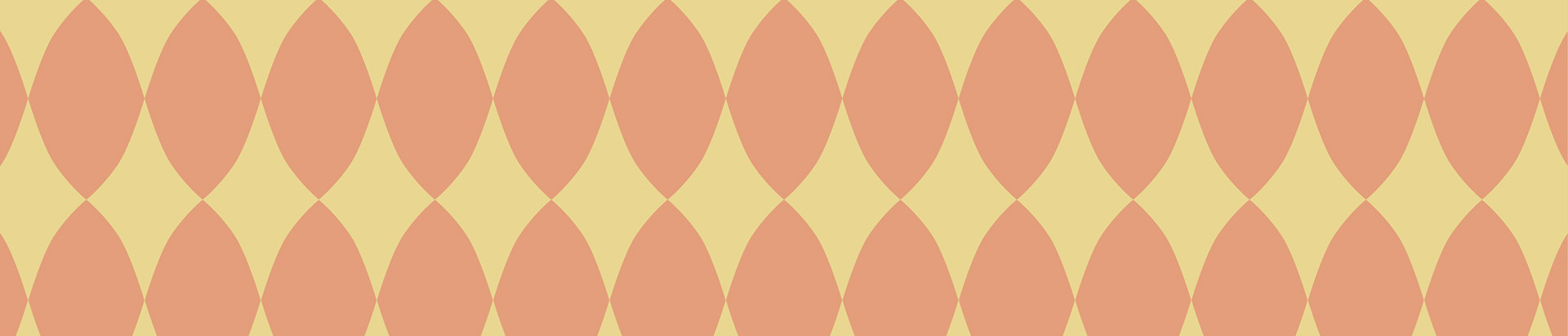
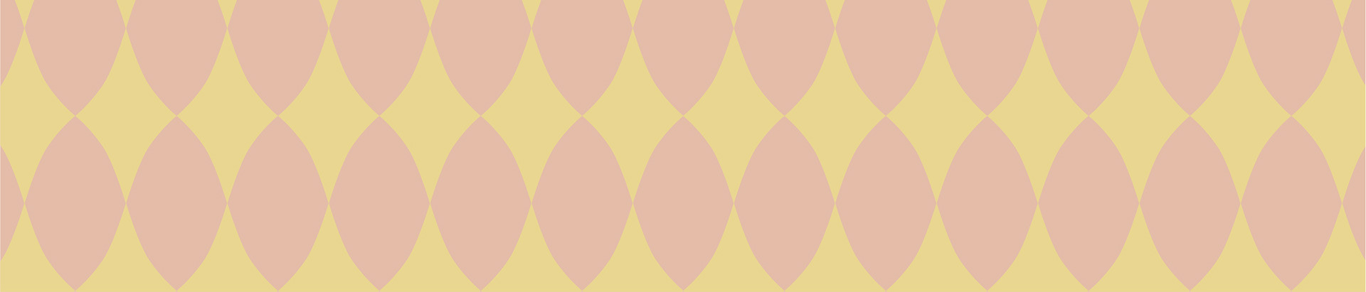
The variety and aromatic complexity of the teas is enhanced by colourful, pastel patterns.
JP
セイカは静岡県に位置するお茶農園です。
静岡ののどかな風景と豊かな茶道の伝統をそのまま伝えていくため、純粋な茶の品種を生産しています。
地元での提供を拡大していき、更には国際的な展開も目指しており、ブランドが彼らの真正性と特性を日本的なデザインに反映することを願っていますが、同時にモダンな感覚も保ちます。
名前は、視覚的にも響きにも、日本語とローマ字で魅力を感じる名前を考えました。
茶葉の複雑で様々な香りのパレットを表現するために、色鮮やかでレトロな要素の入ったパターンのパレットが浮かび上がりました。